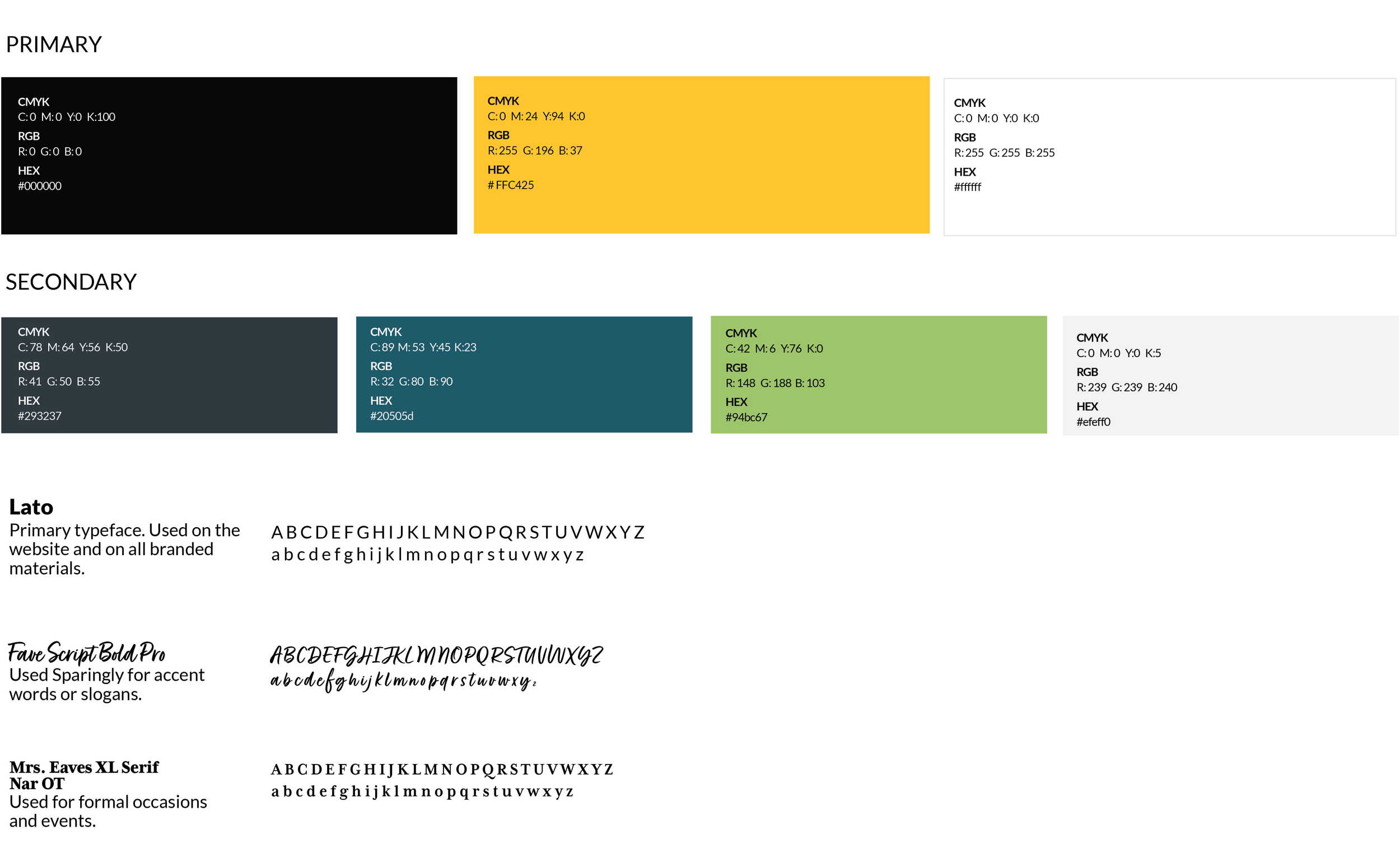
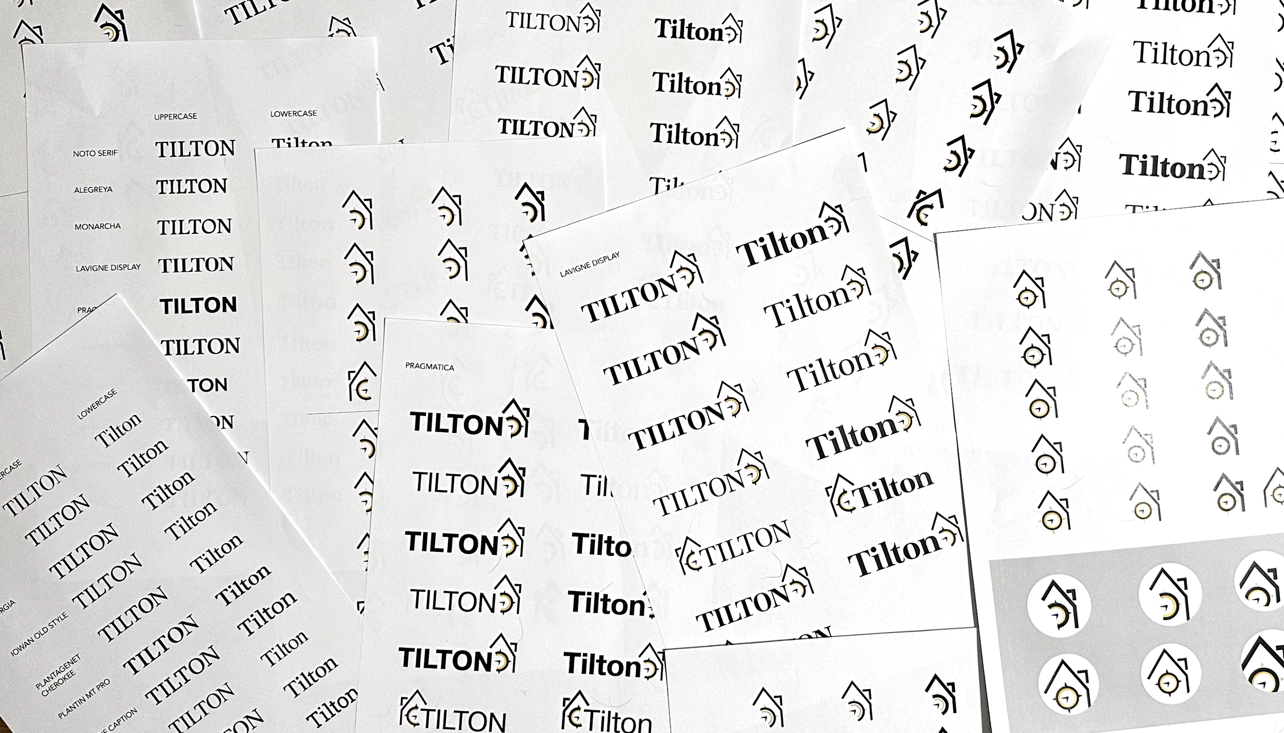
The Logo
Tilton School’s clock tower has become a campus staple over the years and an important part of its identity. The logo which I redesigned in August 2021, incorporates two recognizable features, the clock face and navigation marks. It represents something everyone experiences at Tilton – the intersection of time and direction. Within the clock, the hands are shown at 18:45, military time, the year of Tilton’s founding. These elements work toegether to show that the student’s time at Tilton is limited, and everyday they encounter choices that shape themselves to direct their future.